

Brand Identity Design
SeaTech Rebranded to AquaLock
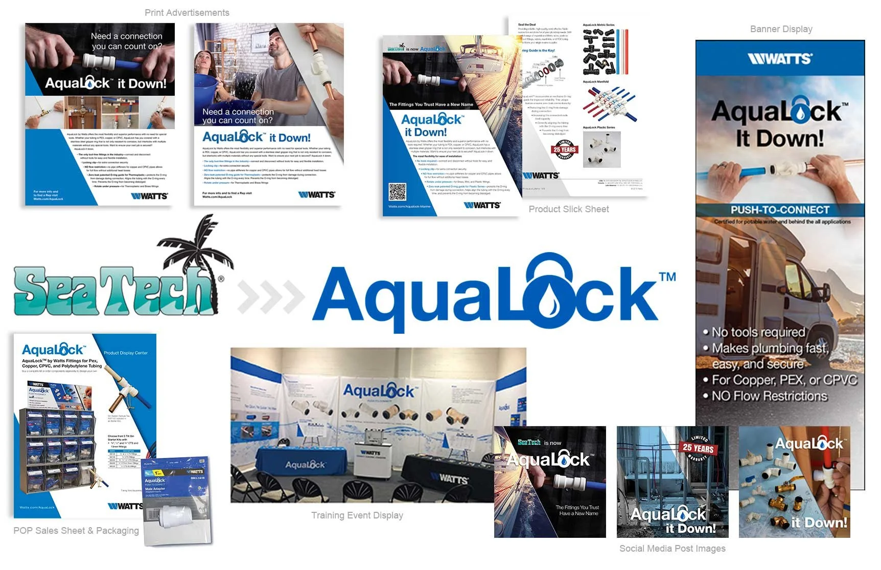
The Challenge: After SeaTech was acquired by Watts, the brand was struggling — losing consumer loyalty and sales in a crowded marine and RV market. It needed more than a fresh coat of paint to rebuild trust.
My Approach: I led the rebrand from SeaTech to AquaLock, collaborating with product specialists to develop a name and logo built around the product's core strength — quick, easy push-to-connect installation in minutes. The name tested well with distributors who understood their end consumers, and the new identity extended across packaging, distributor display units, and trade show banners.
The Result: Within one year of the new name and branding launch, AquaLock won back lost customers, drove a 67% increase in sales, and returned to the #1 product used in Marine and RV water systems.
Lahey Clinic Brand Guidelines
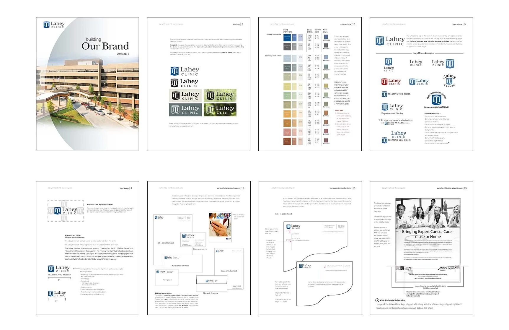
The Challenge: As Lahey Clinic expanded to include 2 hospitals and 62 service lines and practices, each carried its own visual identity, creating inconsistency across the system. Clear guidelines were needed to standardize logo usage, color palette, typography, imagery, and stationery so the brand felt unified across every newly acquired location.
My Approach: I worked with senior leadership and a marketing specialist to develop a comprehensive brand guidelines system — a printed style guide and an online PDF version housed on the Employee Portal for easy reference. With no formal training program in place, I became the ongoing gatekeeper for brand approval, reviewing materials to keep usage consistent moving forward.
The Result: Within the first year, 60% of outdated materials had transitioned to the new brand, and within two years, every entity's website reflected the new look. The added consistency boosted employee pride and engagement, which climbed to 79% among medical staff — and in the years following, Lahey Hospital & Medical Center was ranked a Top 5 Hospital in Massachusetts by U.S. News & World Report, with patient satisfaction reaching 87%.
Lahey Clinic Rebranded to Lahey Hospital & Medical Center
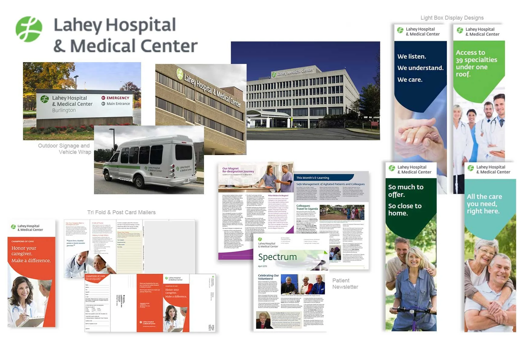
The Challenge: As Lahey Clinic affiliated with Northeast Health System to form Lahey Health, a group of independently branded hospitals, physician practices, and service lines needed to be unified under one cohesive brand. The flagship Lahey Clinic name — synonymous for nine decades with a single physician group practice — no longer reflected the full scope of hospital and specialty care now part of the system, creating the challenge of bringing every facility under one recognizable Lahey Health identity.
My Approach: Starting with only minimal brand direction — name, primary logo, core colors, and fonts — I built out a complete design system to flex across the network: Lahey Hospital & Medical Center, Lahey Medical Center Peabody, Winchester Hospital, Beverly Hospital, Addison Gilbert Hospital, and Anna Jaques Hospital. This meant developing logos and usage guidelines for every entity and service line, along with a secondary color palette, imagery style, and overall design system for consistency across all six organizations.
The Result: Adoption rolled out gradually, taking over a year to reach full consistency across facilities — but it paid off, resulting in fewer off-brand materials appearing externally and faster turnaround when working with outside vendors, who now had a single, clear reference to work from.