

Data Visualization & Presentations
Technical data-driven Infographics
Overview: A sampling of graphics created across a range of industries and formats — from cybersecurity architecture diagrams to public health data visualizations to regulatory policy models — each built to make complex, technical information easy to understand at a glance.
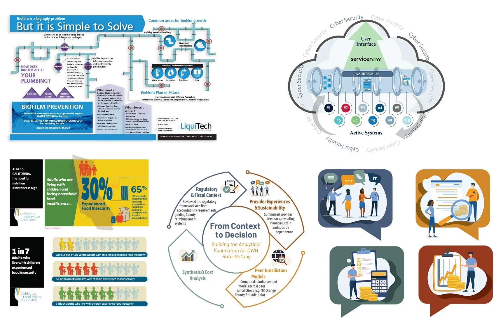
The Challenge: Technical and data-heavy subject matter — cloud security systems, water treatment science, public health statistics, regulatory rate-setting models — is easy to get lost in. The challenge across every project was the same: translate that complexity into a graphic a reader could understand quickly, without losing accuracy or nuance.
My Approach: I partnered directly with IT engineers, scientists, and subject matter experts to break down the technical detail behind each subject, then built clean, reader-friendly visuals — whether that meant mapping a cybersecurity system's architecture, illustrating how biofilm forms in plumbing, or turning food insecurity statistics into a graphic a policymaker could read in seconds.
The Result
Contributed to the successful award of 14 contracts in one year
Used across proposals, briefings, presentations, marketing materials, and educational content
Applied across a wide range of technical subject matter — cybersecurity, environmental science, public health, and regulatory policy
Presentation Deck Designs
Watts Powering Sustainability
Overview: Presentations designed for stakeholders, executives, and customers that turn complex technical and business information into clear, compelling stories, with visuals that often live on beyond the meeting room on websites, at trade shows, and in sales materials.
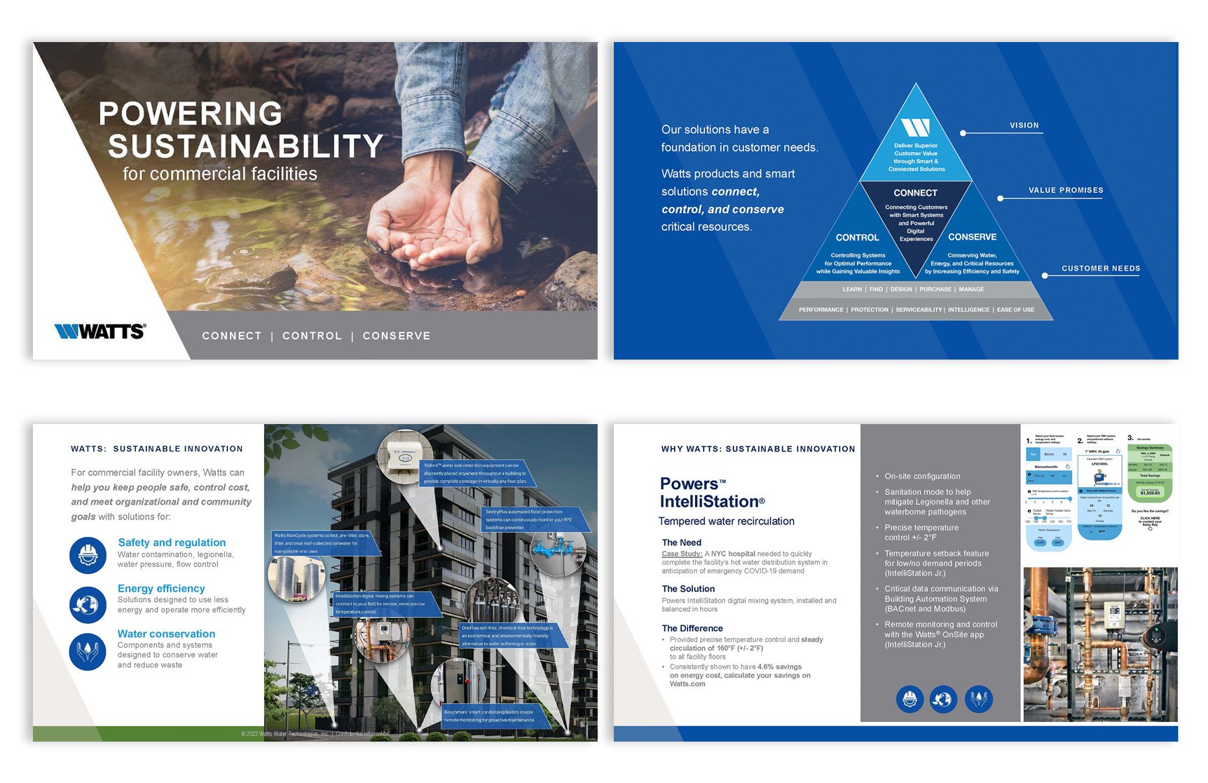
The Challenge: Watts was launching a new company-wide sustainability approach and needed to introduce it to stakeholders in a way that felt strategic, credible, and easy to follow. The story spanned 10 product lines, each with its own dense engineering specs and performance data, plus training, smart technology, and community programs. All of it had to come together as one clear, unified message.
My Approach: Over a year, I partnered with Watts' Sustainability Director to define the areas where the company could make the greatest impact, then drove the design of the full presentation. I created a "Connect, Control, Conserve" framework graphic to anchor the story, and a consistent Need / Solution / Difference layout so stakeholders could compare 10 product lines at a glance. I designed all graphics and icons, selected all imagery, and built a building diagram that shows where each solution lives in a commercial facility. Working from data supplied by product teams, I translated technical results into relatable terms, such as water savings equal to the annual consumption of 4,474 adults and CO₂ reductions equal to taking 31 cars off the road.
The Result: Stakeholders were impressed by the depth of the information and moved the initiative forward. The approach was then rolled out to Watts locations globally to strengthen their sustainability efforts. Slides from the deck were also published on Watts.com and produced as large-format wall graphics for trade shows.
Watts Powering Sustainability
Overview: Strategic presentations that turn complex ideas into clear stories and win leadership buy-in, with results that reach well beyond the meeting room.
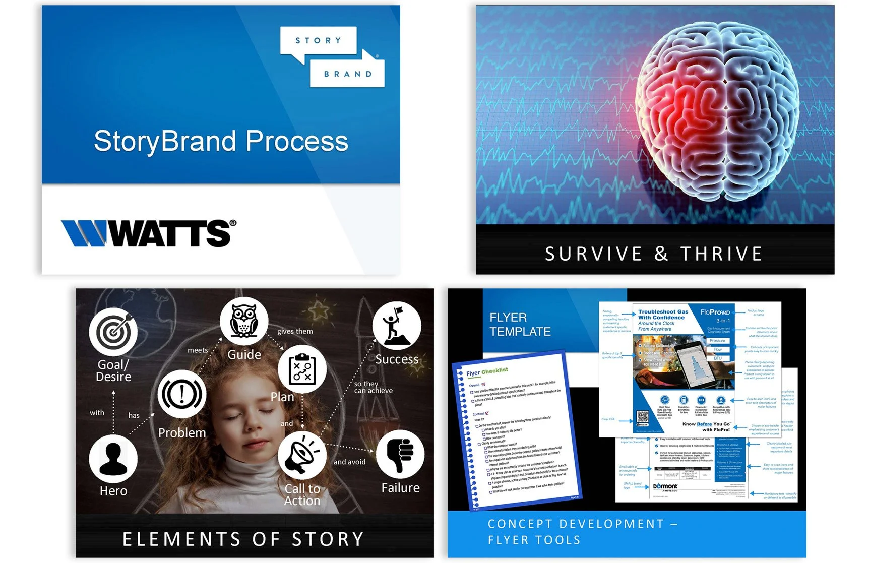
The Challenge: Watts was adopting the StoryBrand methodology to build clearer, more customer-focused conversations with current and potential customers. Senior leadership and the creative team needed to understand the approach and, more importantly, have a practical way to use it on every campaign, from discovery through approval.
My Approach: I designed both the presentation and the creative process behind it. I mapped the full campaign workflow, from kickoff and customer journey mapping through concept review, revisions, and final approval, with clear checkpoints for MarCom managers and product platform teams. I built a branded set of discovery checklists for brand and product kickoff sessions, along with concept review checklists, change logs, and approval logs that kept every round of feedback tracked and accountable. To show the method in action, I created annotated sample templates for websites, flyers, sales email sequences, and social media, each showing how the StoryBrand framework translates into real, on-brand marketing.
The Result
Senior leadership approved the process, and it was rolled out across the marketing team and campaign managers. In the first quarter, the team saw a 30% increase in efficiency, and the tighter review process meant fewer oversight mistakes.