

Technical & Data Visualization
Data-driven Infographics
Overview: A sampling of graphics created across a range of industries and formats — from cybersecurity architecture diagrams to public health data visualizations to regulatory policy models — each built to make complex, technical information easy to understand at a glance.
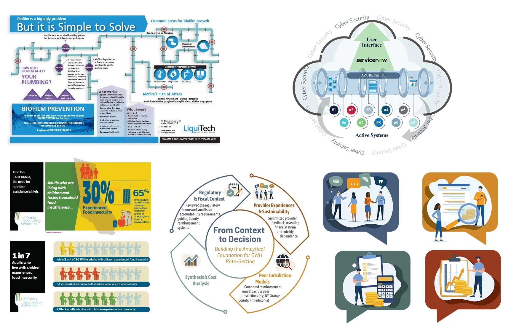
The Challenge: Technical and data-heavy subject matter — cloud security systems, water treatment science, public health statistics, regulatory rate-setting models — is easy to get lost in. The challenge across every project was the same: translate that complexity into a graphic a reader could understand quickly, without losing accuracy or nuance.
My Approach: I partnered directly with IT engineers, scientists, and subject matter experts to break down the technical detail behind each subject, then built clean, reader-friendly visuals — whether that meant mapping a cybersecurity system's architecture, illustrating how biofilm forms in plumbing, or turning food insecurity statistics into a graphic a policymaker could read in seconds.
The Result
Contributed to the successful award of 14 contracts in one year
Used across proposals, briefings, presentations, marketing materials, and educational content
Applied across a wide range of technical subject matter — cybersecurity, environmental science, public health, and regulatory policy